Peter Strain is an AOI, award-winning Illustrator. His work is inspired by film and music as well as social, political and cultural issues. He tackles these with a highly distinctive hand lettering style, bold imagery and humour. In my previous experiments with my photos I attempted incorporating writing into the photos and felt that this effect may have a strong impact on my work. So I decided to look into artists who incorporate writing into their work and found Strain. He does not photograph people but instead paints people and reveals them with wording.
Photo One
This piece is a typographic portrait of the well-renowned filmmaker David Lynch. Strain has used words to reveal Lynch's skin, curving the lettering and distorting the words to create the curvatures in his face; everything else is in a realistic presentation. Majority of the painting is painted in dark tones, bringing more contrast for the warm red-ish tones presenting Lynch's skin. His hair is a prominent faded silver with blue and green undertones, this conveys that Lynch holds wisdom and creativity due to the mess of his hair, suggesting Lynch has a free mind; this is supported by the fact Lynch is known for being talented and has lived a long eventful life. Lynch's expression is blank and lifeless, but the atmosphere is created by the words revealing him; as if it is a message saying that this man's history speaks for himself and he does not need to be explained any further. It is difficult to make out all the words on Lynch's face, but it is safe to assume these words represent Lynch's legacy. To further convey Lynch's creative mind, Strain has presented paint splatters and an artist aesthetic background. with smudges and appearances of chalk. Strain has used the effect of tone to create facial features on Lynch's face, with darker red and brown tones to present creases and shadows on the face, and brighter pink tones to present the highlights on Lynch's face; this keeps a depth within the painting, rather than a flat appearance of lettering.
Photo Two
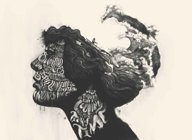
This piece is a part of his 'TYPEface series', a side profile portrait of a woman with her hair formed into the sea. The writing revealing this woman's face is lyrics that Strain had written himself, the lyrics seeming to metaphor the ocean, linking with the appearance of the sea and a boat on the women. The lack of colour removes a welcoming atmosphere that could be created with blue tones in the painting, this though has the viewer focused on the actual creation rather than distracted by vibrant colouring, so they can better understand the message being made. The lyrics and merged sea could convey this woman's story or something that has deeply affected her, something significant to her. This is suggested by the sea being merged on her head, potentially portraying her thoughts, and the lyrics revealing her face, suggesting that these words define her. Like the previous painting above, Strain has presented a artistic aesthetic with the use of paint splatters and slight drips of paint on the woman. This creative aesthetic appears to create a calming and satisfied atmosphere, as though the paint lowers the formality of a painting, and makes a welcoming sense to the painting. Furthermore, the yellow toned background also diffuses the harsh appearance that would've been created if the painting was pure black and white; it creates a warmer feeling.
Photo Three

This piece is titled 'Weinstein Game Over', a cover for Variety discussing the matter of the filmmaker Harvey Weinstein and his sexual assault cases being exposed. The words this time do not reveal Weinstein's face, but rather surround him as if these are the things he can never escape from; rather than these being the things that define him, there are the things that make him. The sentences are statements from the victims of Weinstein's actions, making them bold and clear to read, the intention being to make sure Weinstein's actions not unnoticed. Weinstein's portrait is highly detailed, his facial features distinct and refined, suggesting that Strain wants viewers to recognise the face significantly and to link it with these statements; the harsh details also create a heavier and intense appearance, removing the beauty from the identity. The quotes surrounding him are grotesque and vivid to the viewer, these explicit words will create a tight tension for the atmosphere of the painting, which Strain clearly wants, to create a fear association with Weinstein.
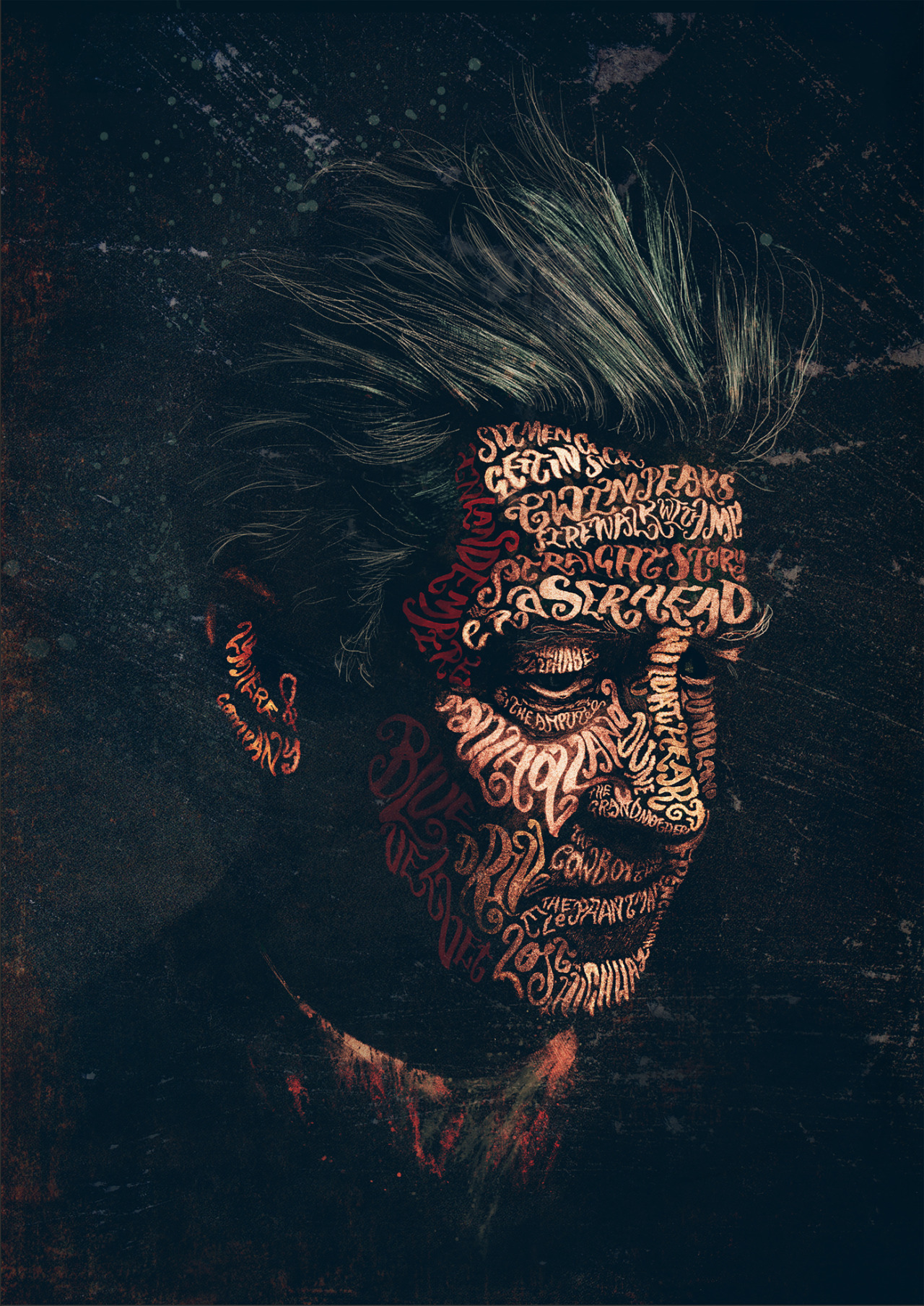
Photo Four

This piece is for the recent release of the film 'Joker', staring Joaquin Phoenix. It is a front profile portrait of the Joker, with a quote from him revealing his skin. The quote appears to discuss his upbringing and the struggle of having a mental disorder; majority of the quote is easy to make out, but in some areas is difficult to read. This is because Strain uses the words to reveal a face, and so proportions the lettering to define curvatures and creases in the Joker's face, such as the words 'mother' and 'happy' are stretched and curved to present the Joker's high cheekbones. The quote being related to the mental illness and this revealing the Joker's skin symbolises that this mental disorder defines him, its what makes him. The neck and shirt on him is a dark charcoal colour and appears faded into the black background, allowing the main feature, his face, to stand out. The Joker's green hair is also presented with refined detailing and use of tone on the colour green, to really bring out the essence and colourful character that the Joker is meant to be in a dark and intense sense. Once again, Strain has presented an artistic aspect to the painting by there being a slight flicker of white over the painting. This use of paint to present an artistic sense always seems to remove a level of formality to the painting, softening the intensity just a little; its as if Strain wants to remind the viewer that this is just a painting at the end of the day, and while it should be taken seriously for its message, it should also just be appreciated for its beauty and skill.
Overall…
No comments:
Post a Comment