Showing posts with label Photographer Research. Show all posts

Tuesday, 26 November 2019

Photographer Research - Duane Michals

Duane Michals

Duane Michals is an American photographer. Michals' work makes innovative use of photo-sequences, often incorporating text to examine emotion and philosophy.
Michals' work inspires incorporating writing with portraiture/documentary but unlike with Strain's work, the two things are not merged together and rather placed with each other, one representing the other; linked but not directly. I feel this style will be more appropriate with photos in my portfolio with a less harsh presentation, so I can still incorporate writing, but in a way that is fitting to all the photos.

Photo One
Image result for duane michals
This piece presents a photo of assumably a couple together on a bed, around the photo is writing from the man in this photo. The top of the photo says 'this photograph is my proof', suggesting this man is trying to prove something to someone, maybe even himself. The writing below says things such as 'when things were still good between us' and 'she did love me. Look, see for yourself', these suggest a split between the two in the photograph, something has changed between them, due to the past tenses used in the man's sentences. The 'see for yourself' seems defensive, especially linked with the 'this photograph is my proof', as if someone doesn't believe this man, and he is desperate to prove that there was a love between the two of them. Say if this photo didn't involve any writing around it, this photo would be a simple romantic photo of a couple to viewers, the interpretation would be positive; but because of the writing there is a darker undertone to the photo, showing that it is a piece of the past and this happiness displayed doesn't exist anymore.

Photo Two
Image result for duane michals
This piece is a series of photos together of a woman with a mirror reflecting her in bizarre ways, some photos with writing beneath them. The title of this series is 'Heisenberg's magic mirror of uncertainty', this better explaining the different reflections in the mirror in each photo. The first piece of writing saying 'Odette can never be sure with any certainty, which reflection of herself she will see in the mirror', this explains the purpose of the series and what it is revealing. The series documents in a way what this woman experiences with the mirror, the photos present a variation of the woman showing what the mirror reflects, she appears calm and contained in the photos, as if she is used to this experience, this being odd since most people would not be calm to such a bizarre scenario. The second piece of writing says 'The act of looking in the mirror affects which image she will see', Michals here is better documenting this woman's experience, explaining the reasoning for such variation. If this series owned no writing around it, viewers interpretations would be very different, the photos would not be seen as documentation and rather as symbolisation, as if this was an identity-themed series of photos, but the words change the premise to the photos entirely.

Photo Three
Image result for duane michals
This piece is of a man with a hat balanced on his head, while a second photo layered on top with the same hat held in the man's hand, with only a few words below the photo. Just below the photo is the sentence 'Magritte with Hat', this sentence in defining terms is redundant, since in the photo it is already clear that this man is with a hat; this redundancy creates almost a comedic effect due to it being so obvious. The photo owns a lot of negative space, making the atmosphere feel open and relaxed since there is nothing forcing the viewer's attention. The composition in the photo is simple, the focal point being the hat relatively in the centre of the photo, the man's expression neutral and his body seeming relaxed. The photo if on its own, with no writing, would seem like a photo for symbolism, something for the viewer to interpret deeper and find a hidden meaning, but due to the comedic sentence below, it removes all potential hidden meaning in the photo, leaving it to be directly what it is.

Photo Four
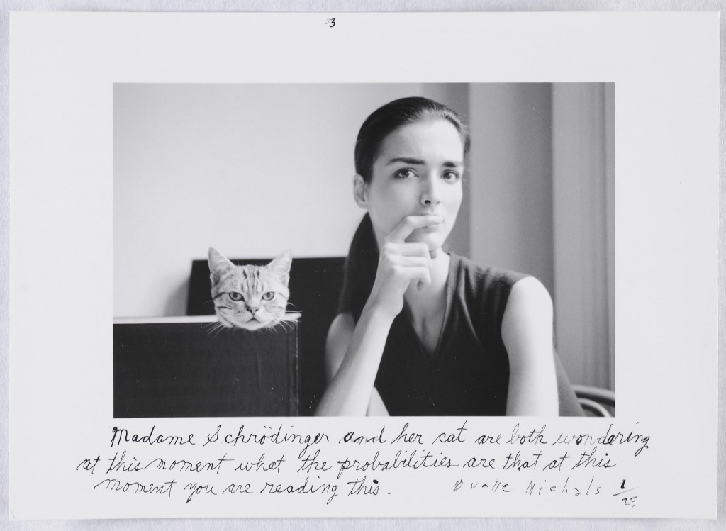
Related image
This piece is a portrait of a woman and her cat, with a short sentence just below it. The photo itself could be a simple portrait this woman wanted with her cat, the composition is simple and the tones from black to white are soft and well blended together, making the photo atmosphere still and calm. The sentence below the photo says 'Madame Schrodinger and her cat are both wondering at this moment what the probabilities are that at this moment you are reading this', this sentence directly address the viewer of the photo, this further brings in the viewer also added with the fact the woman and the cat are directly looking at the viewer. The sentence and overall photo own a serious atmosphere, there is a tension made since the present time and the viewer is addressed, but due to Michals' previous work, there always seems to be a hint of comedy and light-hearted humour in his work, the softness of his presentation also supports this.

Overall…

I believe Michals' interpretation of writing to be humorous and also welcoming for a viewer. His work feels soft in presentation with the gentle use of tone, the lack of colour also removes any harsh colours that could interfere with this subtlety. The use of writing not being merged with the portraiture is a useful way into completely changing the premise of a photo, really conveying the power words hold and the message the artist wishes to present. For my personal project, I want to present the romantic and softer sides of our relationship, and I feel Michals' style in photography is a perfect way to present this aspect of our relationship.

Friday, 15 November 2019

Photographer Research - Peter Strain

Peter Strain

Peter Strain is an AOI, award-winning Illustrator.  His work is inspired by film and music as well as social, political and cultural issues. He tackles these with a highly distinctive hand lettering style, bold imagery and humour. In my previous experiments with my photos I attempted incorporating writing into the photos and felt that this effect may have a strong impact on my work. So I decided to look into artists who incorporate writing into their work and found Strain. He does not photograph people but instead paints people and reveals them with wording.

Photo One
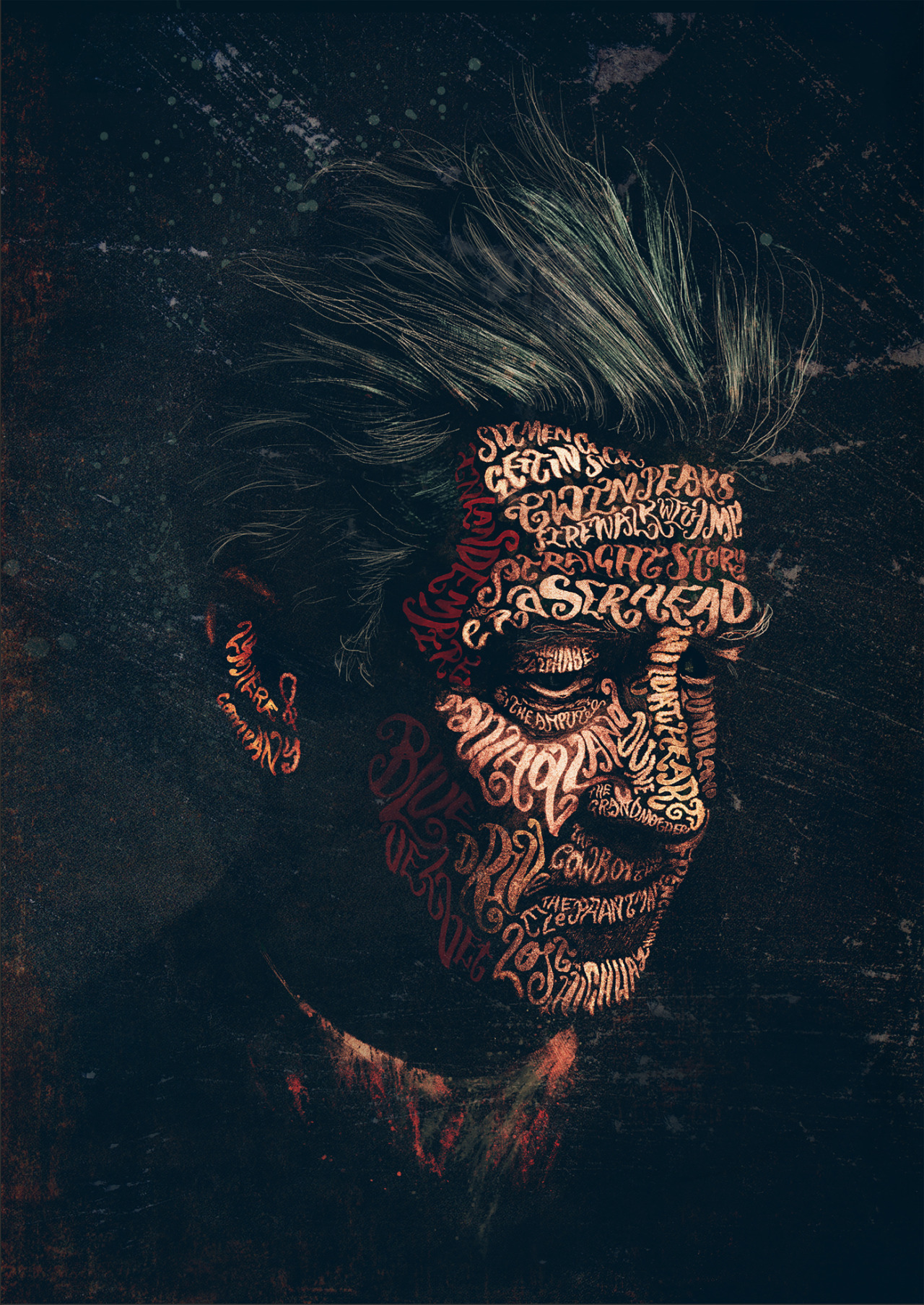
Related image
This piece is a typographic portrait of the well-renowned filmmaker David Lynch. Strain has used words to reveal Lynch's skin, curving the lettering and distorting the words to create the curvatures in his face; everything else is in a realistic presentation. Majority of the painting is painted in dark tones, bringing more contrast for the warm red-ish tones presenting Lynch's skin. His hair is a prominent faded silver with blue and green undertones, this conveys that Lynch holds wisdom and creativity due to the mess of his hair, suggesting Lynch has a free mind; this is supported by the fact Lynch is known for being talented and has lived a long eventful life. Lynch's expression is blank and lifeless, but the atmosphere is created by the words revealing him; as if it is a message saying that this man's history speaks for himself and he does not need to be explained any further. It is difficult to make out all the words on Lynch's face, but it is safe to assume these words represent Lynch's legacy. To further convey Lynch's creative mind, Strain has presented paint splatters and an artist aesthetic background. with smudges and appearances of chalk. Strain has used the effect of tone to create facial features on Lynch's face, with darker red and brown tones to present creases and shadows on the face, and brighter pink tones to present the highlights on Lynch's face; this keeps a depth within the painting, rather than a flat appearance of lettering.

Photo Two
Image result for peter strain
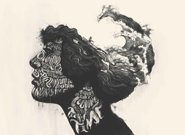
This piece is a part of his 'TYPEface series', a side profile portrait of a woman with her hair formed into the sea. The writing revealing this woman's face is lyrics that Strain had written himself, the lyrics seeming to metaphor the ocean, linking with the appearance of the sea and a boat on the women. The lack of colour removes a welcoming atmosphere that could be created with blue tones in the painting, this though has the viewer focused on the actual creation rather than distracted by vibrant colouring, so they can better understand the message being made. The lyrics and merged sea could convey this woman's story or something that has deeply affected her, something significant to her. This is suggested by the sea being merged on her head, potentially portraying her thoughts, and the lyrics revealing her face, suggesting that these words define her. Like the previous painting above, Strain has presented a artistic aesthetic with the use of paint splatters and slight drips of paint on the woman. This creative aesthetic appears to create a calming and satisfied atmosphere, as though the paint lowers the formality of a painting, and makes a welcoming sense to the painting. Furthermore, the yellow toned background also diffuses the harsh appearance that would've been created if the painting was pure black and white; it creates a warmer feeling.

Photo Three
This piece is titled 'Weinstein Game Over', a cover for Variety discussing the matter of the filmmaker Harvey Weinstein and his sexual assault cases being exposed. The words this time do not reveal Weinstein's face, but rather surround him as if these are the things he can never escape from; rather than these being the things that define him, there are the things that make him. The sentences are statements from the victims of Weinstein's actions, making them bold and clear to read, the intention being to make sure Weinstein's actions not unnoticed. Weinstein's portrait is highly detailed, his facial features distinct and refined, suggesting that Strain wants viewers to recognise the face significantly and to link it with these statements; the harsh details also create a heavier and intense appearance, removing the beauty from the identity. The quotes surrounding him are grotesque and vivid to the viewer, these explicit words will create a tight tension for the atmosphere of the painting, which Strain clearly wants, to create a fear association with Weinstein.

Photo Four
This piece is for the recent release of the film 'Joker', staring Joaquin Phoenix. It is a front profile portrait of the Joker, with a quote from him revealing his skin. The quote appears to discuss his upbringing and the struggle of having a mental disorder; majority of the quote is easy to make out, but in some areas is difficult to read. This is because Strain uses the words to reveal a face, and so proportions the lettering to define curvatures and creases in the Joker's face, such as the words 'mother' and 'happy' are stretched and curved to present the Joker's high cheekbones. The quote being related to the mental illness and this revealing the Joker's skin symbolises that this mental disorder defines him, its what makes him. The neck and shirt on him is a dark charcoal colour and appears faded into the black background, allowing the main feature, his face, to stand out. The Joker's green hair is also presented with refined detailing and use of tone on the colour green, to really bring out the essence and colourful character that the Joker is meant to be in a dark and intense sense. Once again, Strain has presented an artistic aspect to the painting by there being a slight flicker of white over the painting. This use of paint to present an artistic sense always seems to remove a level of formality to the painting, softening the intensity just a little; its as if Strain wants to remind the viewer that this is just a painting at the end of the day, and while it should be taken seriously for its message, it should also just be appreciated for its beauty and skill.

Overall…

I believe the use of words to reveal and define a person in this abstract form is genius and a well-executed design of portraiture. Fluidity to interpretation of the work is small but the use of defining one's identity is powerful and can present strong messages. Strain's work has inspired me to further experiment with the incorporation of writing to my personal portraiture with my partner and I. The use of words in photography can completely recreate a photos message, and it also can truly present what a photo is trying to tell us. For my project I want to present the pure romance between my partner and I, I feel the use of words may be able to express this romance and purity in my relationship if I use the right design.

Sunday, 10 November 2019

Photographer Research - Alfred Eisenstaedt

Alfred Eisenstaedt

Alfred Eisenstaedt was a German-born American photographer. His works were typically portrait pieces for Life Magazine in the U.S., but some of his most popular works were during and at the end of the WW2, specifically on V-J Day, when Japan surrendered, bringing WW2 to an end and the streets of America celebrated. Eisenstaedt would capture couples in their most intimate moments, of celebration and misery, where couples said their potentially final goodbyes and couples celebrating surviving the war. I have found this photographer for the inspiration of location portraiture.

Photo One
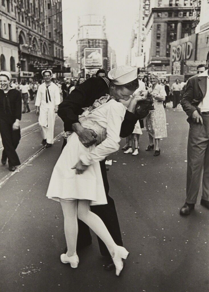
V-J Day, Times Square, New York City 
The photograph from Eisenstaedt that reached an iconic status, depicting this photo as a symbol of romance and love, known as the ‘V-J Day Kiss’. The sailor in black is captured as he embraces the nurse in white, arching her back and locking their lips in tightly; their faces forever concealed by a beautiful kiss. The two were in face perfect strangers and the sailor was on the streets celebrating by kissing many women. The silhouette of the two together presents a passion. The sailor’s hand is tightly gripped onto the nurse’s waist, pulling her in close, the other hand wrapped around the woman’s head to keep her even closer. The grip and pressure that is pulled into these two is pure and symbolises a powerful romance. The sailor’s face is pressed firmly into the nurse’s, you can see the curvature on the woman’s cheek where the sailor is pushed so firmly onto her lips that it is distorting her face. The way the nurse is held and the positioning of her legs, where one is slightly lifted up, and how her arm is fallen to her side, has her presented as delicate and is the prime symbol of femininity. Whereas the strong grip on the sailor’s hand and how he is towered over the nurse presents a symbol of masculinity. In the 1900s this was a prime representation of love between a man and a woman, and still to this day many consider this to be an example of love perfectly. The contrast in colour where the sailor is in black and the nurse in white conveys a message that suggests they may have different backgrounds and be different people, but at the end of the day, these two can still have such a passionate moment. 

Photo Two
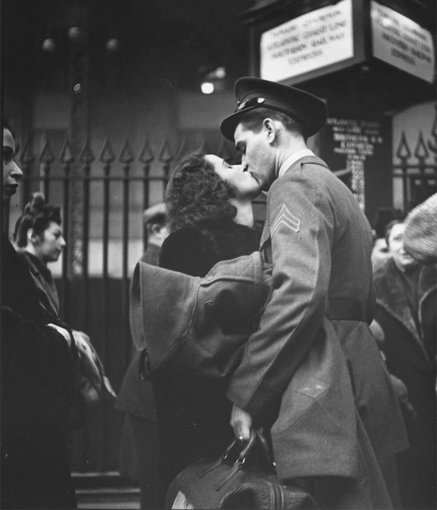
Related image
Here Eisenstaedt captures two loved ones kissing at a crowded departure station. All their surroundings are blurred, leaving only them in focus. This could symbolise them so brought into their kiss that everything around them no longer matters, all that is important is them being together. Based on the fact that the man is dressed in uniform and they are at a station, this can only suggest that this man is leaving to go to the war, making this their potential final goodbye. The lighting above them reveals their faces with a glow, highlighting the kiss in this photo, showing the viewer the significance of this goodbye, making it the standout of the photo. This photo could also represent traditional romance and the stereotypes of men and women. The man being tall with a strong frame, his head pointed down over the woman as he kisses her, this representing a strongly traditional man in those times. The woman just below him in height, her small frame covered by the man’s, and her head facing up to kiss him; this will all make her appear fragile and it can further emphasise the need this woman has for this man. Eisenstaedt in this time had to use film cameras so the black and white wasn’t an option, but it creates a deeper contrast compared to a photo in colour, it allows more focus to be what is actually in the photo rather than the appearance of the things in the photo. Black and white photos appear to be a more traditional to romantic photos also. 

Photo Three
Image result for alfred eisenstaedt
This is a film photo of two people, a man, and a woman kissing in the Times Squares streets during V-J Day. The photo is in portrait format and presents a large amount of the two's surroundings. Due to the lack of closeness between the two compared to the other couples, we could infer that these are just mere strangers celebrating V-J Day; their bodies aren't pressed close together and the woman's body language appears too stiff for this man to be her partner. Granted, the joy is still there between the two, the man has a strong hold onto the woman's head suggesting passion running through him, and you can detect a joy within his facial expression as he kisses this woman. Their surroundings present an open and free feeling, due to the leading lines to clear sky behind them from the buildings and the open road behind them also, where people are scattered around. The centring of the two, while their surroundings are scattered with people and confetti, creates a symbol of celebration, and due to them kissing, the logical inference is the celebration of love and peace. 

Photo Four
Related image
This shot from Eisenstaedt presents a man and a woman locked into a kiss at appears to be a station of some sort. The atmosphere appears quiet and forlorn, suggested by their serious expressions as they kiss each other. Furthermore, the large windows behind and above the two's heads create a formal and restricted sense in location, compared to the V-J Day photos, there is a lack of freedom in their location. The brick walls and people surrounding them suggests they are in a station, and due to the context when Eisenstaedt was photographing, we can infer that these two are saying goodbye before the man goes off to war; similar to the second photo in this blog. Eisenstaedt had used a film camera due to the times, no flash being necessary because as we can see, the natural light has covered the whole photo and revealed the two in a delicate presentation. The composition Eisenstaedt has captured this appears as though he has taken this photo in secret. This is inferred from how close two people are to the left side of the camera and the low-level pointing up to the two kissing, as though Eisenstaedt was trying to hide the fact he was taking the photo, this also creates a candid photo. The grip in the man's hand on the woman's arm suggests passion and desperation to not leave her and stay close to her. Their bodies are pressed closely together as they kiss, conveying a need to feel each other for as long as possible before it is too late and they have to separate.

Overall…

I feel Eisenstaedt's work has taught me how a location can change a story and message of a photo. The photos above if the location was changed to a simple studio setting, the passion, and forlorn symbols would no longer exist, and you wouldn't understand the lovers' stories. The use of location, like many other factors in a photo is very important when it comes to considering the message you want to send. Eisenstaedt has inspired me to experiment with the use of location in my future shoots so I can better vary the composition styles I will use in my final portfolio, so I can reveal all the aspects of a romance between my partner and I.

Thursday, 26 September 2019

Photographer Research - David Bailey

David Bailey

David Bailey is a well renowned British fashion and portrait photographer, capturing many celebrities and making commissions for musicians. Bailey isn't distinct for couple portraiture, but his method of portraiture is iconic and I feel would be a perfect inspiration for my style and personal project. Since he isn't distinct for couple photos, I have found portraits where he has captured two people together, to keep on track with my couple portraiture work.

Photo One
Related image
This shot is of the artists Paul McCartney and John Lennon, members of the band The Beatles. The first thing that catches the eye about this photo is the positioning of the two men. Lennon being placed above McCartney, but he is more towered over him. Lennon's arms are rested on McCartney's shoulders, making his hands cover the body of McCartney; this leaving McCartney to appear smaller in size compared to Lennon. Furthermore, Lennon's head is rested on top of McCartney's head, this also having McCartney appearing smaller, but this also presents a relationship between the two men; the fact that the viewer can see they are both comfortable with this closeness will convey a history between the two men, whether the viewer knows who they are or not. Their expressions are calm but also could be perceived as intimidating due to the eye contact they make with the camera and the lack of emotion within them. Going back to the dominance between the two in positioning, Lennon being more dominant in the frame will give him more significance to the viewer, suggesting that he is more important than McCartney, but the contact between the two allows Lennon to pass over some of that dominance to McCartney, as if Lennon is making it clear that McCartney is significant to him and therefore should be significant to us.

Photo Two
Related image
This shot is of the celebrities Cara Delevinge and Pharrell Williams, this being for a magazine shoot. Once again, Bailey has used the power of positioning and composition to create a power play between two people. Delevinge being placed in front of Williams, covering his whole body, leaving only his face and arm exposed. Delevinge is even holding Williams' face, establishing and even more powerful presence. Typically in the world, men are seen to be the more powerful characters rather than the women, however, in this photo, Develinge is given the presence of a powerful woman, overpowering a man in the photo. Williams is almost seen to be worshipping Delevinge by him being held by her. They both have an expression of pride and comfort for each other, this equalling out their dominance in the photo. The two are very close to each other, thus forming a relationship for the viewer; this further supported by the clear comfortable expressions on both. Furthermore, the two celebrities are wearing the same clothing, this matching in style further supports a personal relationship between the two, this also equalling out their dominance again because by wearing the same clothing it suggests they see each other as equals together.

Photo Three
Image result for david bailey
This shot is of the brothers Liam and Noel Gallagher. Here the positioning is equal, both are stood at the same level next to each other, neither are doing something different to the other. This equality gives them both an equal but very powerful dominance in the photo, their backs are pressed together, this suggesting a relationship and union between the two; this putting their dominance together to create something dramatic in the atmosphere of the photo. The brothers also looking very similar in appearance to each other gives the viewer the idea that these men are very similar to each other overall, once again furthering this equality. However, for a viewer that knows the history between these two brothers, the equality will become rather ironic. The Gallagher brothers were in the same band Oasis, where they performed iconic music for a long period of time, but eventually, the band split up which came to a shock to many followers of the band, since it seemed a spontaneous decision. After a while, it had come out that the brothers do not speak to each other or really have any relationship at all, and the issues they have between each other is what caused the band to split up. From various interviews and exposure, it seems the rivalry between the two is strong and there is no way of having whatever issue they have resolved. I cannot find when this photo shot by Bailey was taken, but say if this was taken before the rivalry begun, you could say that this photo becomes a piece of nostalgia, where it presents what once was. Furthermore, if you go the other way and suggest this was taken after the rivalry began, you could say that Bailey wished to present that even though these two do not like each other, that they are still brothers, and that is what makes them equal to each other.

Photo Four
Related image
This shot is once again of the celebrities Cara Delevinge and Pharrell Williams. Bailey uses positioning again to create a more dominant subject within this shot; that being Delevinge. Delevinge is sat at a much higher level than where Williams is sat, allowing more of Delevinge to be in shot and only Williams' torso. Compared to the previous photo of the two, Delevinge is less dominant in this photo because before, Williams' body was covered, but now that their bodies are next to each other in comparison, you can see that Delevinge is a lot smaller in size compared to Williams; this making her appear weaker in comparison to the previous photo. Here the relationship between the two appears more disconnected than before. In the previous photo, the two had expressions of amusement and pride while they were rather close to each other, in this photo, the two appear more serious rather than amused as if they are trying to show the viewer that they are people to take seriously; they are also not as close as before. This photo appears more formal than personal and that removes some of the connection between the two, weakening the relationship. Granted they still appear as a couple, but a less joyful one, more of a power couple. Like before they are wearing the same clothing, thus creating a union between the two and telling the viewer that they should be seen as equal with each other.

Overall…

I feel Bailey's style when it comes to two people/couple portraiture is an experimentation of power and union between the two subjects. The variety of positioning and composition that can be used to present a couple as one is wide and Bailey has shown just some of those, and he has inspired me to further experiment that. Although isn't distinct for couple portraiture, I feel his general style when it comes to portraiture immensely inspiring and professional, and so I will follow that style for my work. In my further shoots, I will go on with the inspiration to experiment with composition and the presentation of unity.

Monday, 23 September 2019

Photographer Research - Nastia Cloutier-Ignatiev

Nastia Cloutier-Ignatiev

Nastia Cloutier-Ignatiev is a 19-year-old portrait, fashion and beauty photographer based in Montreal. Her work is high quality modelling and is not afraid to be explicit with her work. She depicts people as sultry and intimate to the camera while other bizarre things could be surrounding them. Cloutier-Ignatiev goes for an alternative and intense approach, wanting the viewer to be almost shocked with what they are witnessing but also charmed by it.
"People say that I am the kind of photographer who gets fascinated by faces and bodies; that it’s as if lips and eyes dictated the way I capture the instant. That behind my aesthetic style, I am all about getting the most out of a simple situation." - Cloutier-Ignatiev
I felt Ignatiev's style, especially in this portfolio titled 'Love', was an intimate and strong method in presenting passion and love between two people, and potentially a useful style to incorporate in my personal portfolio.

Photo One
The boy- Boris @boris.leblanc The other boy- Yan Etchevary @yan.etch by Nastia Coutier-Ignatiev @nastia.jpg.jpg
This piece was shot by the photographer Nastia Cloutier-Ignatiev, it is of two people’s mouths close together, almost as if they are kissing, but their mouths are parted and overlapping each other. Ignatiev is using close-up photography but not wide-angle or else that would distort too much of the appearance of the mouths. She has used a light studio setting and macro quality when it comes to detailing on the models’ faces/mouths. The use of lighting and editing used has created a distinctive sample of colours, where the pink in the lips is harsh yet subtle at the same time. Judging by there being facial hair on one of the mouths and lack there of on the other, this photo is presenting a male and female in an intimate state. There is a tension presented in this photo due to the closeness, the women’s nose is pressed up against the man’s philtrum, which you can see slightly lifting his upper lip, and the pressure even lifting the woman’s lip slightly. Even though they are touching it seems incomplete because their lips are not pressed together, and the woman’s teeth are grazed on the man’s lower lip. The photos motion seems heavy as if the movement between these two is frantic. The closeness between the two suggests a comfort with each other and a history, making a photo appear personal. 


Photo Two
Related image
This piece is shot by the photographer Nastia Cloutier-Ignatiev, the piece is of two people close-up, and the female's lips are pressed up to the male's neck and her tongue against his skin. Once again, Ignatiev has used a close-up composition and bright studio setting for the lighting. The high definition creates a grain to the photo when perceiving the stubble on the male's neck and the taste buds on the woman's tongue; this high definition could be to emphasise and convey the passion between these two people. Both people lack identity due to their full faces not being revealed, the man not even having any facial features revealed removes almost all of his identity, the full focus now being left on the woman's mouth against his neck. The woman's tongue dragging against the man's neck suggests sensuality and conveys a strong intimate expressions given to the man. A viewer could feel uncomfortable when viewing this photo because the photo appears so personal, as if the viewer shouldn't be viewing this, it is just for the two people involved. But that is what makes it so much more special, the fact that these two people are willing to let people see how much they love each other and how comfortable they are with each other, they wish to flaunt that almost.

Photo Three
The girl- Karo Vadnais @karo_vadnais The other Girl- Karine St-Michel @karinestmichel by Nastia Coutier-Ignatiev @nastia.jpg-3.jpg
This shot is a close-up of two presumably women's faces pressed together and one women's thumb inside the others mouth. Ignatiev's use of lighting creates a high definition on the ladies skin and the creases in their lips, creating a intense appearance. The colouring of this photos makes the ladies lips a vibrant pink but they fit subtly with the rest of the photo. You can assume these are both woman from the fact that neither have facial hair and both of their lips are feminine and shaped like a typical woman's; the skin also appears fragile rather than rough like a typical man's. When looking at this photo it is almost like you can hear them breathing, their mouths being parted open suggests breath, the way they are parted also suggests something sensual about this situation. The woman's thumb pressed into the other woman's mouth conveys a desire to silence her, to keep her quiet from her breaths; most probably caused by the other woman with her thumb in the other's mouth. This also very intimate action could show the comfort between these two, strong enough to have confidence in doing such an action to each other; this comfort and confidence expressing their love for each other.

Photo Four
The girl- Aïcha @the.mixed.mess The boy- Anthony @the.chvmp1on by Nastia Coutier-Ignatiev @nastia.jpg-2.jpg
This shot is a close-up of two people, male and female, with the woman biting and tugging on the man's lower lip with her teeth. The high definition, macro lens quality, captures and reveals every little detail on their skin, having them appear grainy and static in some areas. The man's lower lip is a saturated pink with warm undertones that give a sense of warmth and comfort for the viewer and the photo overall; both people's skin tones also being warm and even creates a calming atmosphere. This calming atmosphere is strong since it can make such a harsh appearing action, biting a lip, still feel calm and steady. The action of biting the man's lip appears aggressive in sexual aspects, like this woman has a desire to express her attraction towards this man, and she has the confidence to do this is such a daring and explicit way. There is a slight lift on the woman's upper lip in the corner, suggesting a snarling action from her, this emphasising the aggression and intensity. Once again, the comfort and confidence within this woman conveys her love for this man, this being Ignatiev's intention I feel.

Overall…

I feel Ignatiev's style and method of presenting two people's love for each other is vivid and daring. The explicitly within her work truly grabs the attention of the viewer and leaves them with an odd feeling, but still brings the message across that these people in this photo love each other, no matter any other factor. The high definition quality is eye-catching and pleasing to the eye, with warm tones and the vivid pinks from the models' lips presenting a purity even with the mouths being sensual. I think this method will be useful to experiment with for my personal project and even worthy of being placed into the final portfolio. I have always enjoyed the daring style some photographers use and think this particular one would be perfect in expressing my love for my partner.